Art Style
Franco-Belgian / Ligne Claire Comic Style
Precision, clarity, and European elegance
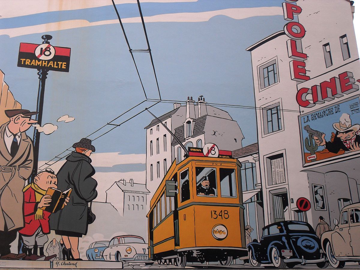
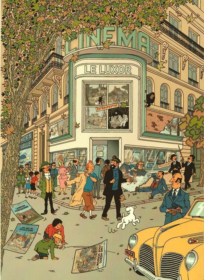
Ligne claire — French for "clear line" — is the comic art philosophy that less is more. Developed by Hergé for Tintin and embraced by a generation of Belgian and French artists, this style achieves remarkable depth and detail through disciplined restraint: uniform ink lines, flat color, and architectural precision.
Hergé and the Belgian school
Georges Remi, known as Hergé, developed his ligne claire approach across the 1930s and 40s while creating The Adventures of Tintin. His philosophy was that every line should be equal weight, every form clearly bounded, and every color flat — no gradients, no atmospheric effects. This system allowed enormous detail without visual chaos. The Belgian school he inspired, including artists like Edgar P. Jacobs, Bob De Moor, and Jacques Martin, refined these principles into a coherent visual language that influenced European comics for decades and continues to be taught in illustration schools today.
The art of controlled detail
What makes ligne claire exceptional for storytelling is its readability. The uniform line weight means no element dominates at the expense of others — backgrounds are as precisely rendered as characters, creating a rich sense of environment without sacrificing character clarity. The flat color fills, while simple, are chosen with great care, and the lack of shadows or gradients gives the work a timeless quality that doesn't date. It's a style that rewards careful looking: the more you examine a ligne claire panel, the more detail you discover.
Create a story in this style →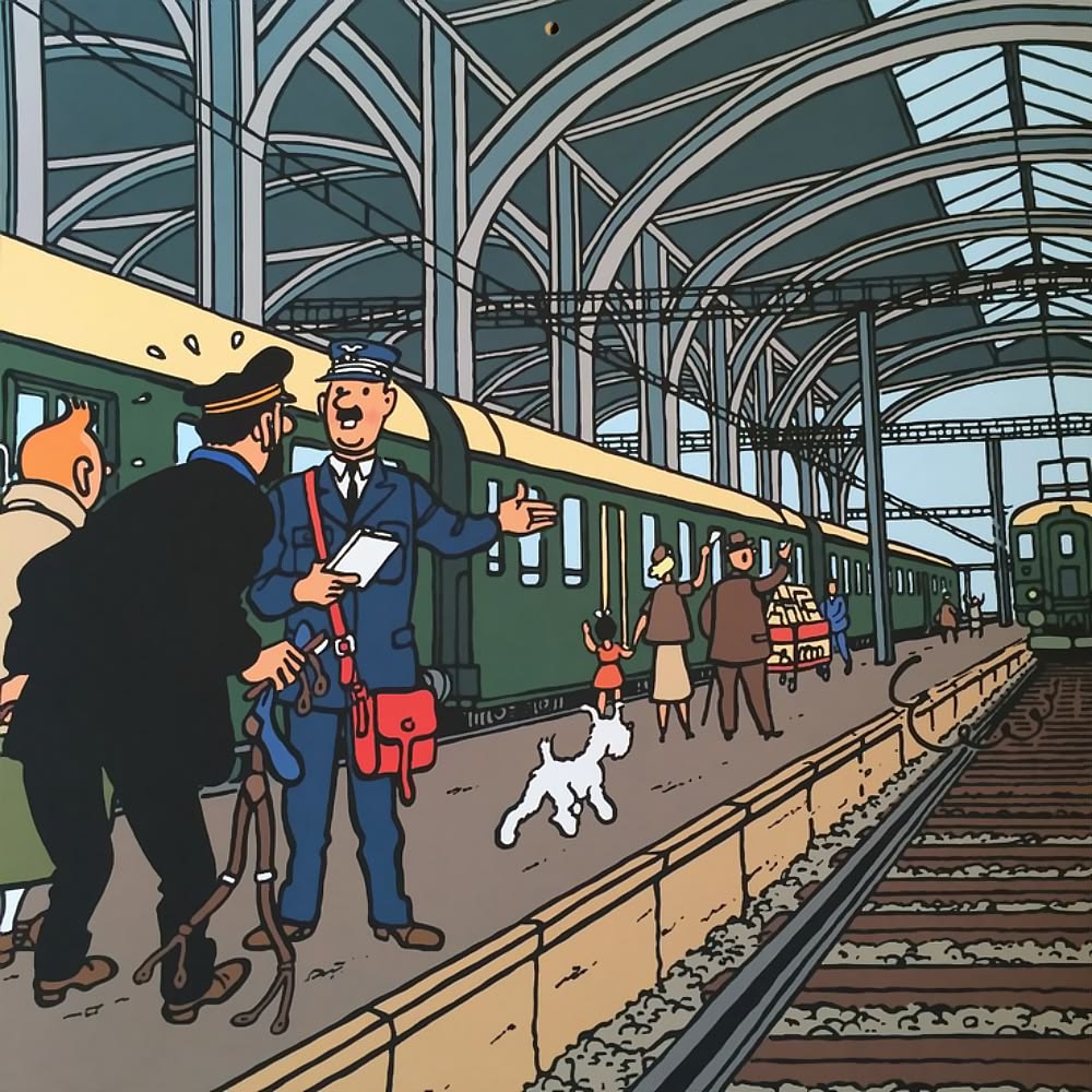
Style Characteristics
Origin
1930s Belgium
Best for
Adventure, Mystery, Travel
Mood
Elegant, Adventurous
Complexity
Medium–High
Ready?
Start your story
in Franco-Belgian / Ligne Claire.
YarnSaga generates consistent, publication-ready panels in this style — across every character, every scene, every page. First story is free.