Art Style
Spider-Verse Comic Style
The comic book explosion you can feel
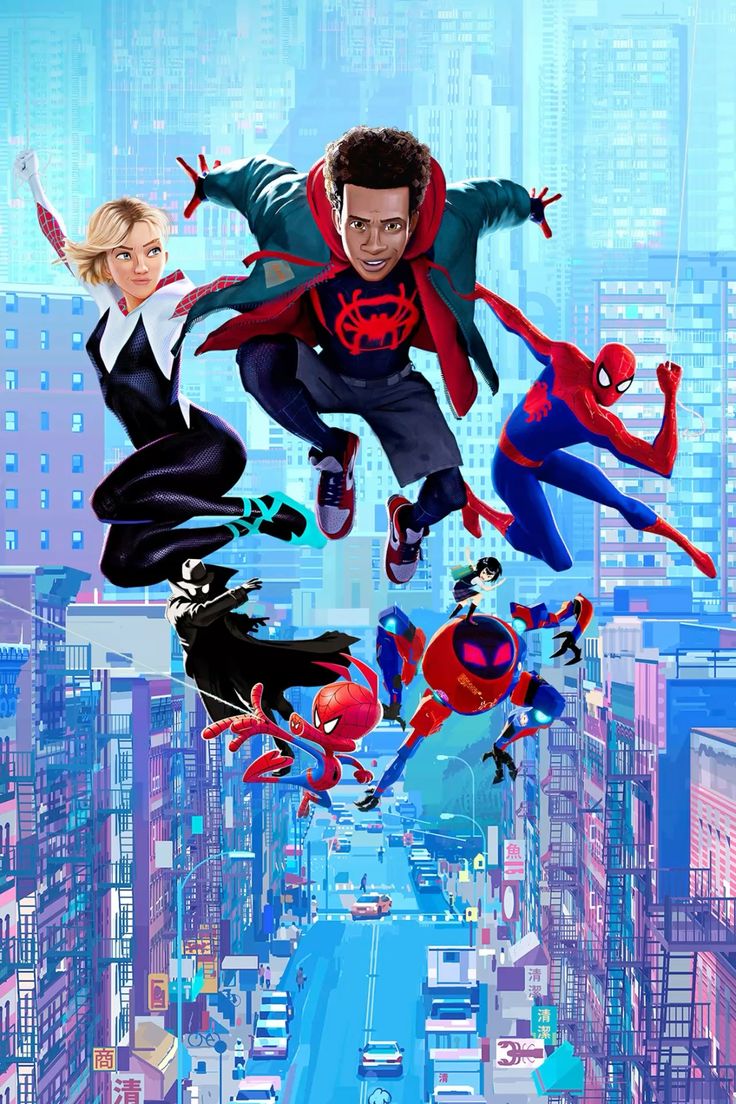
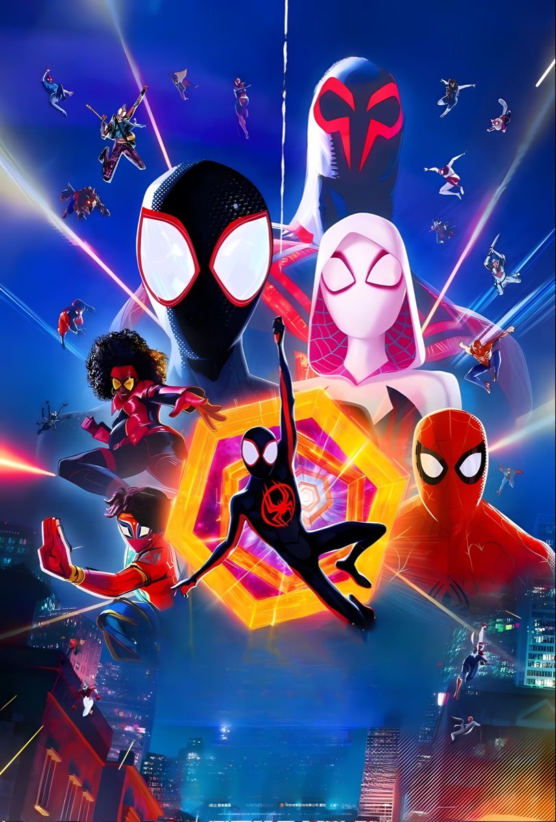
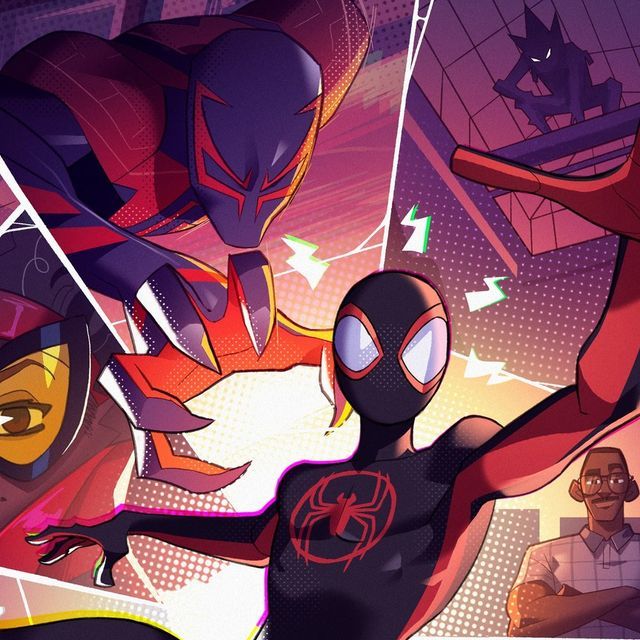
Spider-Verse style is what happens when animation and comic books collide at full speed. Bold halftone dots, chromatic aberration, and kinetic distortion create a visual experience that is simultaneously nostalgic and radically new — the most exciting development in comic art aesthetics in decades.
How Spider-Verse reinvented animation
When Sony's Spider-Man: Into the Spider-Verse won the Academy Award for Best Animated Feature in 2019, it didn't just win an award — it changed an industry. Directors Peter Ramsey, Rodney Rothman, and Bob Persichetti worked with production designer Justin K. Thompson to create a visual system that had never been attempted in feature animation: different characters rendered in completely different art styles, all coexisting in the same frame. The film deliberately incorporated the "mistakes" of print comics — Ben-Day dots, misregistered colors, speed-line overlays — turning imperfection into innovation.
A new visual grammar
Spider-Verse style works because it is visually honest about what it is: a comic book come to life. The halftone dots remind you that you're watching an adaptation, while the kinetic distortion of action sequences captures the way extreme speed actually feels rather than how it looks. The vivid neon palette — electric purples, hot pinks, acid yellows — creates emotional intensity that matches the high-stakes storytelling. This style is perfect for stories where the medium itself becomes part of the message.
Create a story in this style →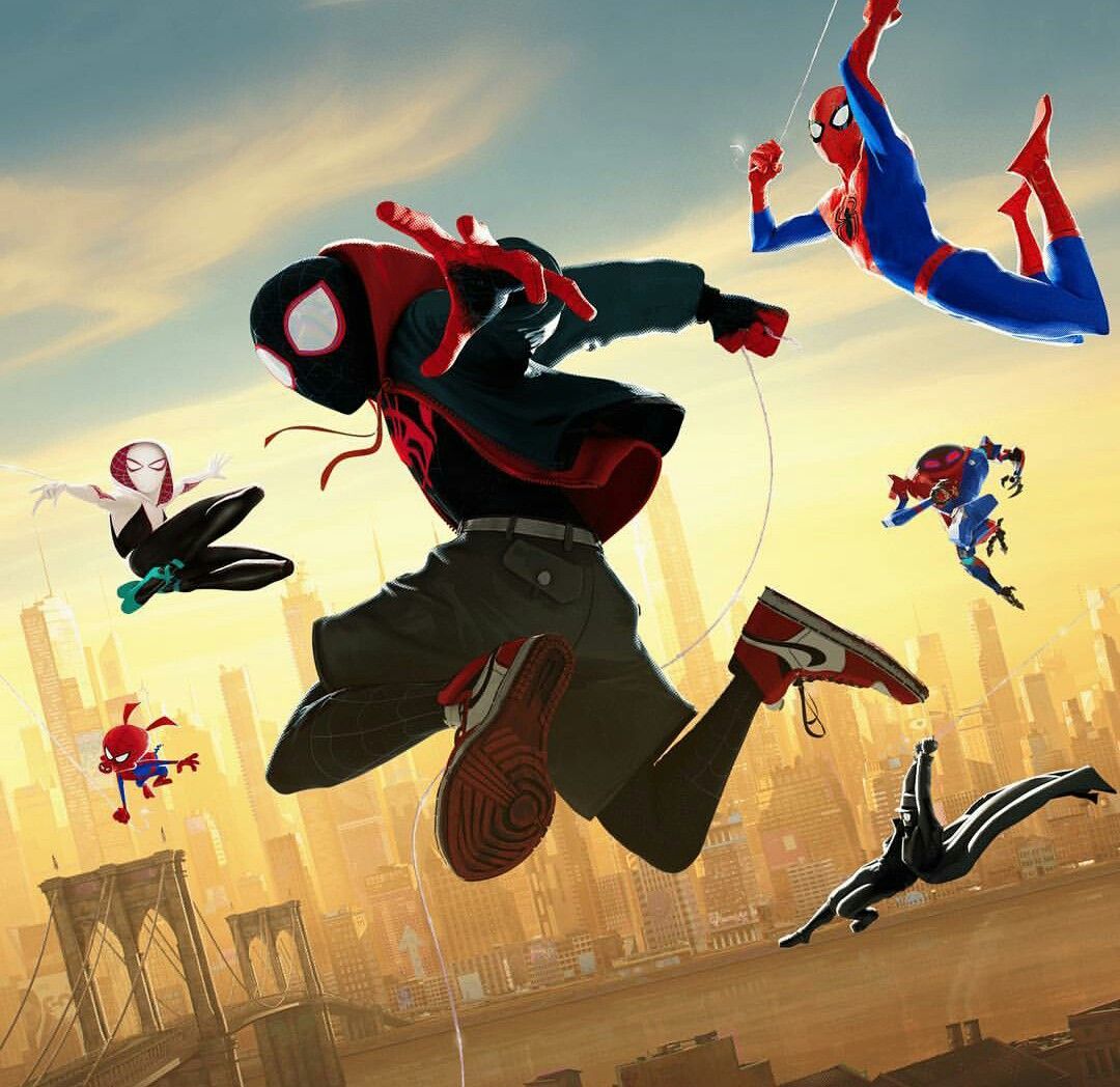
Style Characteristics
Origin
2018, Sony Pictures
Best for
Action, Superhero, Sci-fi
Mood
Kinetic, Vibrant
Complexity
High
Ready?
Start your story
in Spider-Verse.
YarnSaga generates consistent, publication-ready panels in this style — across every character, every scene, every page. First story is free.