How to Add Speech Bubbles to a Comic: Types, Placement, and Lettering
May 2, 2026 · 8 min read
Speech bubbles are what separate a sequence of illustrated panels from an actual comic. They carry dialogue, thought, narration, and sound — and the shape of the bubble tells readers as much as the words inside it. A round bubble means calm conversation. Jagged edges signal shouting or shock. A cloud-shaped bubble signals a private thought. Get the bubbles right and your comic feels professional. Get them wrong and even great artwork reads as amateurish.
Here's everything you need to know about adding speech bubbles to a comic — from the different types to placement, typography, and how AI comic generators handle them automatically.
The Different Types of Comic Speech Bubbles
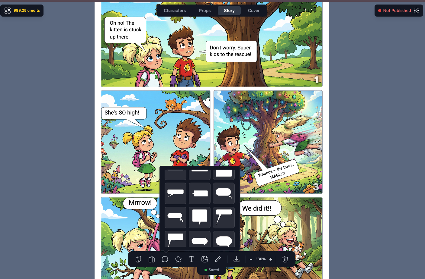
There are more bubble types than most people realize. Each has a specific communicative function:
- Speech bubble (round/oval): Standard dialogue. The tail points toward the speaker's mouth. Used for normal spoken conversation.
- Thought bubble (cloud shape): Internal monologue or thoughts. Instead of a tail, a series of smaller circles leads to the speaker. No quotation marks needed.
- Shout bubble (jagged/spiky): Yelling, rage, or shock. Sharp points around the edge signal high emotional intensity.
- Whisper bubble (dashed outline): Hushed or quiet speech. The dashed border visually communicates low volume.
- Narration box (rectangle): Not a bubble at all — a rectangular caption box. Used for third-person narration, internal monologue in past tense, or scene-setting text.
- Electronic/radio bubble (squared with sharp edges): Dialogue coming from a device — walkie-talkie, phone, intercom. Signals the voice is mediated.
- Burst bubble (starburst shape): Sound effects, exclamations, or sudden realizations — "BAM!", "CRACK!", "AHA!"
Where to Place Speech Bubbles in a Panel
Placement is not decorative — it's functional. Readers in Western comics read left-to-right, top-to-bottom. That means:
- The first speaker goes in the upper-left area of the panel
- Replies go to the right or below
- The bubble tail must clearly point to the speaker without overlapping another character's body in a confusing way
- Bubbles should never cover eyes, faces, or action focal points
- Leave breathing room — don't crowd the panel with text
In manga (right-to-left reading direction), these rules reverse: first speaker upper-right, replies go left. Webtoons that scroll vertically often place bubbles in the center, with dialogue flowing downward.
Typography Inside Speech Bubbles
The font you use inside a bubble matters almost as much as the bubble shape. Comic lettering has evolved specific conventions over decades:
- ALL CAPS is standard in American superhero and adventure comics. It maximizes readability at small sizes.
- Mixed case works better in slice-of-life, literary, and European-influenced comics — it feels less "shouted."
- Bold for emphasis: Key words in a sentence are bolded to mimic spoken stress. "I told you never to open that door."
- Text should never touch the bubble edge — leave 8–12px of padding (or equivalent) around all sides.
- Avoid serif fonts for dialogue bubbles — they're harder to read at small sizes and feel wrong in comic context.
How Many Words Per Bubble?
Comics have a tight economy of space. Dialogue needs to be brief. A few working rules:
- 35 words per bubble is a common maximum — beyond that, break into two bubbles or cut the text
- Shorter sentences read faster and create pacing — which is itself a storytelling tool
- One bubble per speaker per panel in most cases — two bubbles from the same character can work to show a pause or interruption, but use sparingly
- If a character is delivering a long speech, consider a close-up panel dedicated to that dialogue, or split it across multiple panels
Common Mistakes When Adding Speech Bubbles
Even experienced comic creators make these errors:
- Ambiguous tails: If the tail doesn't clearly point to one speaker, readers don't know who's talking. Tails should be distinct and unambiguous.
- Too much text: Dense bubbles break pacing. Cut ruthlessly. If it can be shown visually, show it — don't say it.
- Bubbles covering important art: Never place a bubble over a character's face, a critical action moment, or a detail the reader needs to understand the story beat.
- Wrong bubble type: Using a round speech bubble for a shout, or a cloud bubble for spoken dialogue, sends the wrong signal. Match the bubble to the emotional content.
- Inconsistent bubble style: If you use a clean, minimalist bubble style in one panel and a decorative ornate style in the next, the comic feels incoherent. Pick a style and stick to it.
Manga Speech Bubbles: Specific Conventions
Manga has developed its own distinct bubble vocabulary that differs from Western comics:
- Vertical text: Traditional manga uses tategumi (vertical writing), which runs top-to-bottom. Modern digital manga often uses horizontal text, especially for international audiences.
- Elongated vertical bubbles: To accommodate vertical text, manga bubbles are often tall and narrow rather than wide and horizontal.
- Borderless bubbles: Many manga speech lines have no border at all — just text floating in white space near the character. This creates a clean, open-page aesthetic.
- Angular thought lines: Manga thought bubbles often use angular, spiky shapes rather than the puffy cloud shape common in American comics.
- Sound effects integrated into art: Manga SFX (onomatopoeia) are often drawn as part of the artwork itself, with large stylized kanji placed directly over action.
Using an AI Speech Bubble Generator
Adding speech bubbles manually — whether in Photoshop, Illustrator, Canva, or Clip Studio — is time-consuming. You're creating shapes, placing tails, setting typography, and adjusting position for every single panel. For a 10-page comic with 40 panels and 80 dialogue exchanges, that's a significant amount of production work before the creative part even starts.
AI comic generators like YarnSaga handle speech bubbles as part of the comic creation workflow. You write dialogue when setting up each panel, and the generator places the bubbles correctly — with appropriate shape, sizing, and positioning — in the final rendered image. For each panel, you can choose:
- Bubble type (speech, thought, shout, whisper, caption)
- Shape and style matched to the art style (manga bubbles look different from superhero bubbles)
- Which character is speaking (so tail direction is handled automatically)
The result is a complete panel with dialogue integrated — not artwork you then have to hand-letter separately. For creators who want to publish without a separate lettering production step, this is a significant time savings.
Speech Bubbles and Art Style Consistency
One detail that's easy to overlook: speech bubble style should match the art style of the comic. Thin, minimalist bubbles look right in a manga or webtoon context. Bold, thick-bordered bubbles with strong outlines fit superhero comics. Aged, rough-edged bubbles with slight paper texture belong in a noir or vintage Western aesthetic.
When bubbles and art style mismatch — clean digital bubbles on hand-drawn scratchy art, or retro-styled bubbles on a sleek sci-fi comic — the finished page looks assembled rather than designed. Consistency in every element, including bubbles, is what makes a comic feel like it came from a single creative vision.
The Tail: The Most Important Part of Any Bubble
The tail is a small detail that carries enormous weight. A few rules that professional letterers follow that amateur creators typically don't:
- Tail origin point: The base of the tail should exit from the bottom third of the bubble — not the center, not the top. Tails from the center of a bubble look mechanical.
- Tail direction: Point at the speaker's mouth (or face), not their body center. The specificity matters — a tail pointing at a chest looks unfinished.
- Single curve, gentle angle: Tails that bend dramatically, reverse direction, or make sharp turns look awkward. Keep them simple.
- Tail size: Short, stubby tails feel constrained. Very long tails that travel a large distance across a panel feel disconnected. Aim for the tail to travel no more than 1/3 of the panel width.
- Off-panel speakers: When a character is speaking from outside the panel frame, the tail points to the panel edge. The bubble stays inside the panel; only the tail reaches the boundary.
Summary: Speech Bubble Checklist
Before finalizing any comic page, run through this list:
- Correct bubble type for each dialogue moment (speech, thought, shout, whisper, caption)
- Tails point clearly and unambiguously to the correct speaker
- No bubbles obscuring faces, eyes, or key action
- Reading order flows naturally left-to-right, top-to-bottom (or right-to-left for manga)
- Text is legible at the final print/display size — minimum 8pt for print, larger for digital
- Bubble style is consistent throughout and matches the art style
- All dialogue has been tightened — every word earns its place
Speech bubbles are invisible when done right. Readers absorb the dialogue and move on without consciously noticing the lettering. When they're done wrong, readers notice immediately — confused about who's talking, squinting at small text, or distracted by bubbles covering the artwork. The goal is transparency: let the story breathe through the bubbles without the bubbles getting in the way.
Create your first story — no drawing skills needed
Characters stay consistent across every panel, automatically.
Request Early Access →More Articles
Explore YarnSaga