What Is Screentone in Manga? The Dots Behind Every Grey
November 2, 2026 · 7 min read
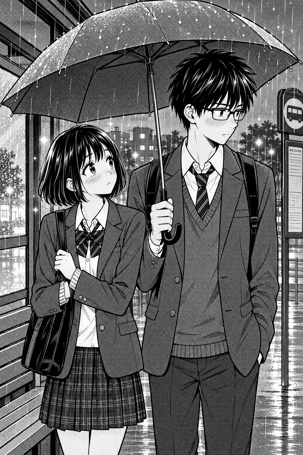
Screentone is the dot pattern manga artists use for grey. A manga page is printed in pure black ink on white paper, so there is no grey ink to shade with. Instead, artists fill an area with tiny black dots: the more space the dots cover, the darker the area looks from reading distance. Skin shadows, a school uniform, an evening sky, the glow around a love interest — in a black-and-white manga, almost every mid-tone you see is screentone.
This guide covers what screentone is, where it came from, the main types of tone, how artists use it, and how to get the same look in your own manga without cutting a single sheet.
Dot screentone gives the sky, the clothes and the shadows their grey, with no grey ink on the page.
What is screentone in manga?
Screentone (in Japanese usually just tōn, トーン) is a pattern of printed dots or lines that stands in for a grey tone. Traditionally it came as a thin, transparent adhesive sheet. The artist laid the sheet over the inked page, cut out the shape they needed with a craft knife, peeled away the rest and rubbed the tone down onto the paper.
The trick works because of how printing works. A printing press for a cheap weekly magazine lays down black ink or nothing; it cannot print a smooth grey. Dots are something it can print. When the dots are small and close together, your eye blends them with the white paper around them and reads the area as grey. Newspapers used the same idea for photographs for over a century; manga turned it into an art form.
Why manga uses screentone instead of grey
Manga grew up in weekly and monthly anthology magazines printed in huge runs on cheap paper, with each chapter drawn against a deadline measured in days. Colour was too slow and too expensive, and soft grey washes would have turned muddy on that paper. Screentone solved both problems: it printed cleanly, and it was fast — far faster than hatching every shadow by hand.
Over the decades the constraint became the style. Readers came to associate the dot texture with manga itself, which is why artists who now draw entirely on a tablet still add digital screentone on purpose. If you want the full background on why manga stayed black and white, our post on the black-and-white manga style covers it.
Types of screentone
Art supply shops in Japan sell thousands of tone sheets, but they fall into a handful of families:
- Dot tone. The classic. A regular grid of round dots, sold by density (how dark it looks, from light 10% to heavy 50% and beyond) and by line count (how fine the grid is). Fine dot tone reads as a smooth grey; coarse dot tone reads as visible, retro texture.
- Gradation tone. Dots that grow from tiny to large across the sheet, so the grey fades from light to dark. Used for skies, hair sheen, light falling across a room, and the soft fade at the edge of a shadow.
- Line tone. Parallel lines instead of dots. Good for rain, speed, metal and dramatic backgrounds.
- Pattern tone. Pre-printed textures: brick, wood grain, fabric, clouds, and the flowers, bubbles and sparkles that fill the background of a shōjo romance when a character's heart skips a beat.
- Effect tone. Ready-made speed lines, focus lines and burst patterns for action and shock moments.
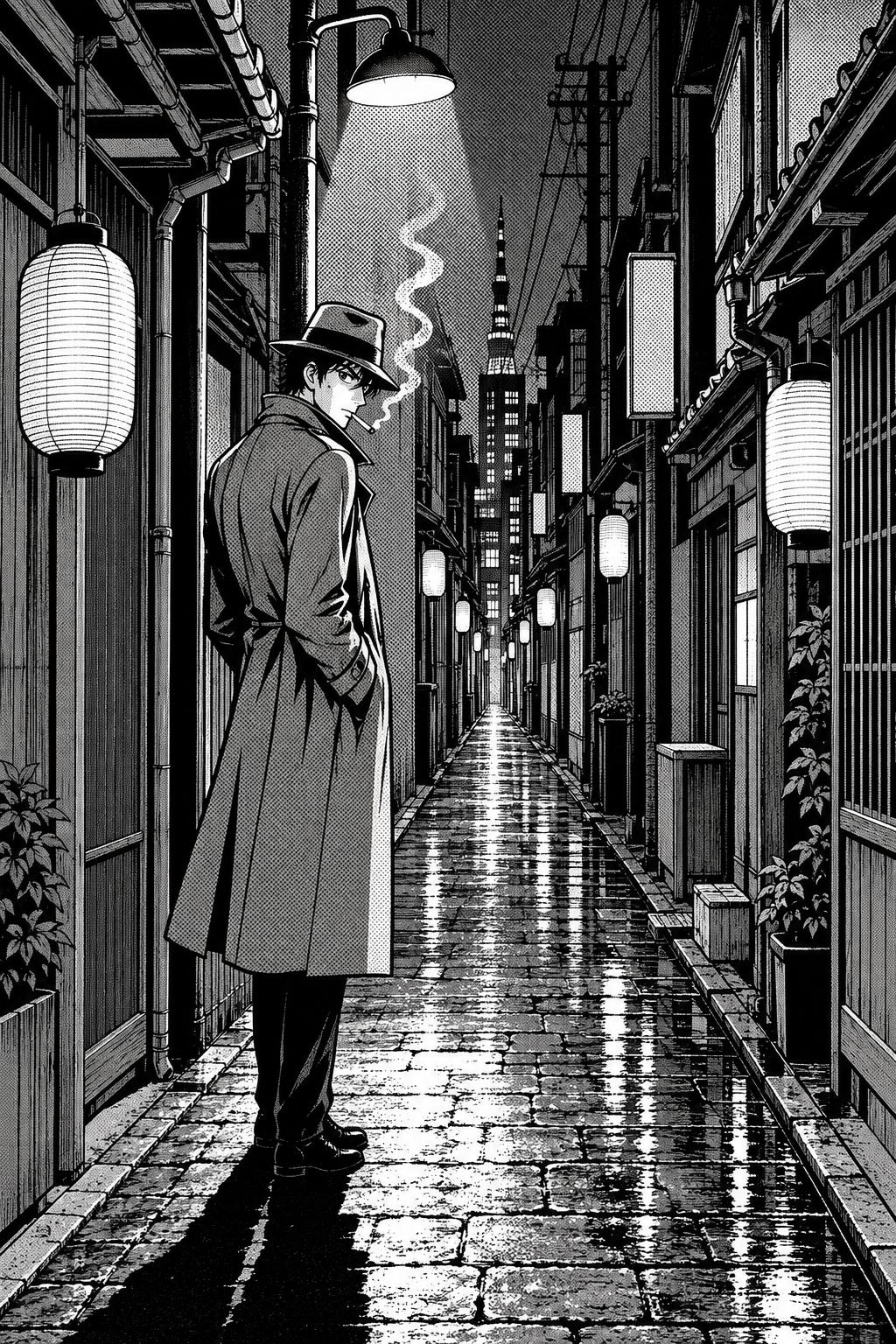
Darker tone plus solid black builds a night scene without any colour.
How manga artists use screentone
Tone is not just a way to fill space. Good manga artists use it to direct the reader:
- Shadow with a hard edge. Manga shadows are usually a flat tone with a crisp border, not a soft blend. It keeps the page clean and readable at small sizes.
- Separating figure from background. A light tone on the background and bare white on the character (or the other way round) makes the character pop without any outline changes.
- Mood. A heavy, dark tone over a whole panel signals night, dread or grief. A light gradation from the top signals a bright, open moment.
- Highlights by scraping. Artists scratch the dots away with the blade to leave white highlights inside a tone: the shine on dark hair, the glint on a sword, the light in an eye.
- Restraint. White paper is a tone too. The pages that hit hardest often use very little screentone, so the panels that do use it stand out.
One classic problem is moiré: when two dot patterns overlap at slightly different angles, they create a wavy interference pattern. Artists avoid layering tones carelessly for exactly this reason, and it is also why manga scanned or resized at the wrong resolution sometimes looks shimmery on screen.
Screentone vs hatching vs grey wash
There are three ways to suggest shading on a black-and-white page, and manga uses all of them for different jobs:
- Hatching (lines drawn by hand) is expressive and textured, good for rough surfaces, older or grittier stories, and intense close-ups. It is also slow.
- Screentone gives an even, mechanical grey that prints cleanly and reads as unmistakably manga.
- Grey wash (ink diluted with water, or soft digital grey) gives smooth gradients, but it is rarer in classic manga because it reproduces poorly on cheap paper. It shows up more in art books and some modern digital releases.
Traditional vs digital screentone
Physical tone sheets are still sold and still used, but most professional manga today is finished digitally. Drawing programs built for comics let you fill an area with grey and convert it to a dot pattern at a chosen density and line count, or paint with tone brushes directly. The result looks the same in print; the difference is that mistakes cost an undo instead of a fresh sheet.
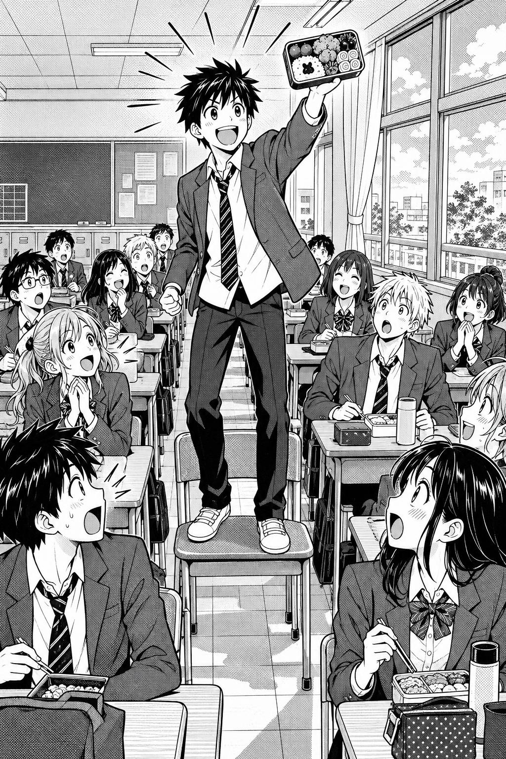
School life with light tone on the backgrounds and bare white on the faces.
How to get the screentone look in your own manga
If you draw, the route is a comic-focused drawing app and a lot of practice with knowing where not to put tone. If you don't draw, or you want to get a story onto the page faster, YarnSaga's Manga (Black & White) style draws every panel in ink and screentone: dot tone for the mid-greys, hard-edged shadows, bare white highlights in hair and eyes, and speed lines for action. There is no colour anywhere in the image.
The tone is part of the panel that gets generated, so you shape it through the scene description rather than by cutting sheets. Ask for "night, heavy shadow" or "bright morning light" and the tone follows the mood. Your characters stay the same across the whole chapter because every panel is drawn from the same character sheet (more on that in how to keep AI comic characters consistent).
From there, letter the page with speech bubbles — our guide to manga speech bubbles covers bubble types and right-to-left reading order — and arrange panels into pages. The manga maker page walks through the whole workflow, from your first character to a published chapter.
Screentone FAQ
What is screentone made of?
Traditional screentone is a thin, transparent plastic film printed with a dot or line pattern, with a light adhesive on the back. Artists cut it with a craft knife and rub it onto the page. Digital screentone is simply a dot pattern generated by drawing software.
Is screentone only used in manga?
No. Western comics used similar mechanical tints for decades, and the related Ben-Day dots gave classic American colour comics their look. But manga is where screentone became a defining part of the art style rather than just a printing technique.
Why does manga look grey if it is printed in black and white?
Because of screentone. Tiny black dots on white paper blend together in your eye and read as grey. The page itself only contains black ink and white paper.
Can I make a manga with screentone without drawing?
Yes. Pick the Manga (Black & White) style in YarnSaga, describe your characters and scenes, and every panel comes out in ink and screentone with your characters kept consistent. You still write the story, direct each panel and letter the dialogue.
Is manga or anime the one with screentone?
Manga. Anime is animated and drawn in flat colour, so it does not use screentone. If you want the colour anime look instead, the Manga / Anime style is built for that.
Ready to try it? Open the app, start a new story, and pick Manga (Black & White).
Create your first story — no drawing skills needed
Characters stay consistent across every panel, automatically.
Request Early Access →More Articles
Explore YarnSaga